
Beyond The Visualization Zoo

The best document I have read on visualization is called "A Tour Through The Visualization Zoo" by Jeffrey Heer, Michael Bostock, Vadim Ogievetsky. It's a must-read picture book for aspiring Data Scientists. Most of the graphics from this post are examples of the Tour taken from the d3 gallery.
Philosophical Absorption
The most cited academic in the field is @EdwardTufte, our esteemed data visualization philosopher. Like any good philosopher, he is merely articulating things that we already know, but had not yet crystallized into coherent opinions. Freud, McLuhan and Dawkins may have been mavericks in their heyday, but criticism of any mainstream philosophy today comes across as archaic.
His philosophy is baked in: we understood the sparkline the moment we saw our first one. You can read Tufte's books and consider the philosophy of data visualization and user interaction, or you can troll the d3 gallery with a critical eye and decide the benefits, limitations, and design violations of each item.
 Infauxgraphics
Ironically, now that I have spent time looking at visualizations, the ones that look the least dated are the ancient ones from pioneers like Sankey, Bertin, and Tukey. Visualizations that stray from the established canon are almost always frivolous with questionable value. As the Tour says: "In many situations, simple data graphics will not only suffice, they may also be preferable."
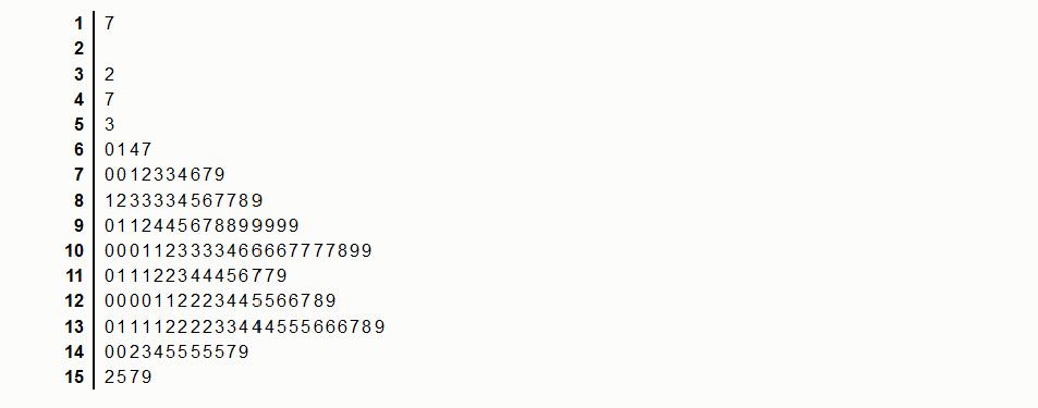
The stem-and-leaf plot fell out of favour as histograms became easier to make, but they show a window to raw data that bar charts and histograms don't.
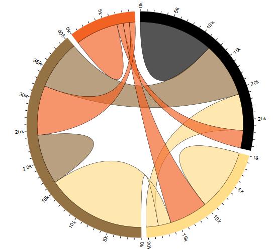
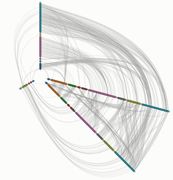
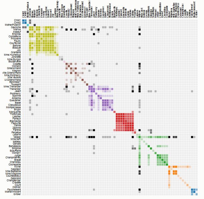
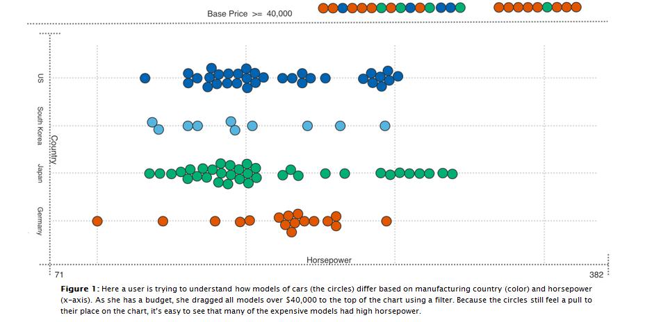
The few modern additions to our canon are the heatmap, sunburst, chord, and hive plots. It's important to notice that both the chord diagram and hive plots came from Martin Krzywinski, a bioinformatician in a cancer research team.
Power of "Gah!"
Krzywinski's graphics may have beautiful form, but he is primarily concerned about function. The plots didn't come from wanting to make pretty pictures - they were born out of frustration. It was impossible to gleam any meaningful interpretation from their graphs because genomic data didn't fit into any of the traditional plots. His team looked at the plots of ugliness and said "Gah! there HAS to be a better way to do this!" The dense network graphs looked like hairballs and his hive plot provided a much-needed comb.
Researchers are still banging their head against the wall with genetic and ecological data sets that don't have suitable plots, so I expect a few more good viz ideas to come from our biologists. Their current attempts look like relationships (dendrograms and networks) mashed into metrics (scatterplots and donuts).

Multidisciplinary Mash-ups
Each visualization comes from a specialization. We've come close to the limits that each of our specializations can take us and it has turned from an asset to a liability. Today's most celebrated research teams employ methods of several disciplines, which is a very difficult feat to pull off in the ivory tower. Out in the wild web, combining multidisciplinary data has become standard - it's just how we do. Using the term "mash-up" is as redundant as "AJAX" or "responsive design".
Code 3.0: So Close, Yet So Far Away
While perusing the d3 gallery, I am simultaneously excited and disappointed by the GitHub Visualizer. It opens the curtain to a new experience and interaction with code, and then it falls on its face in a cloud of vapidity. There's a video on youtube of the visualizer showing every commit of the Linux Kernel 1991-2012. AWESOME.. almost. It's 2h45m long and doesn't actually tell the viewer anything useful about the commits other than who made them and when.
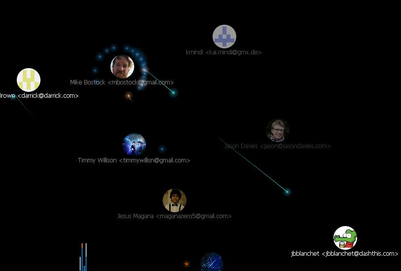
Imagine if the GitHub visualizer had an interactive timeline and showed a detailed description of how the commits interacts with each part of the operating system and the main patterns or tricks used. This information can't be extracted automatically - it has to be crowdsourced, which is the part that makes it "3.0". I'm most interested in the kind of tricks used, because once we deconstruct the program into basic patterns, we can assign each pattern a symbol, and make some very powerful and immersive experiences.
Heads Up!
Gaming HUDs are our most immersive data experiences as Sony and Oculus Rift keep pushing the envelope. From poker to pew-pew-pew, HUDs are carefully crafted to maximize player efficiency at a single task. Scaffolding quickly promotes the uninitiated user into a novice. Whenever someone is trying to design a dashboard for data workers, the HUDs are the place to start. The cockpit style dashboards may be ok for golfing executives, but not for people actually working with the data.
Visualization's Greatest Limitation: "Look, don't touch"
Current dashboard designs are for SHOWING data, not WORKING on it - the controls change the views, not the process. Combine HUDs with Mechanical Turk, and then we're cooking with gas. As I mentioned in my first blog post, the best example of this is FoldIt. Foldit has a single purpose: "identification of the structural configuration of natural proteins."
These decisions are difficult for a computer, but fast for humans.. fun, even. Students can play the game long before they learn what proteins are and why they fold. All unnecessary details of the raw data are abstracted away and the user experience is tactile and simple, opening new doors in research and education, inspiring projects like EteRNA.
Data workbenches will help us search, sort, grind, clean data and lots more. They are theyoke to hitch onto our workhorses to clear the path to Web 3.0; the glue that brings web mash-ups and big data analytics together.
We're slowly getting there, but the "3.0" ball won't start rolling until a detailed roadmap with workbenches, data formats, and crowdsourcing is diffused by evangelists like Berners-Lee.Your Portfolio: Keep Away From The Edge!
Going beyond the visualization zoo carries the risk of falling into an infauxgraphics trap, or worse: get saddled with so many viz projects it becomes your title. When building your Data Science portfolio, keep it simple. Grab matplotlib or ggplot2 and make some plots using the standard library - the data is the star, not pretty pictures. Over 70% of project time is spent on boring data formatting and tedious cleaning (ETL + clean). For all the hype surrounding visualization and analytics, they are a small part of the job. Can you pipe data from one API to another? Read my last post on how.